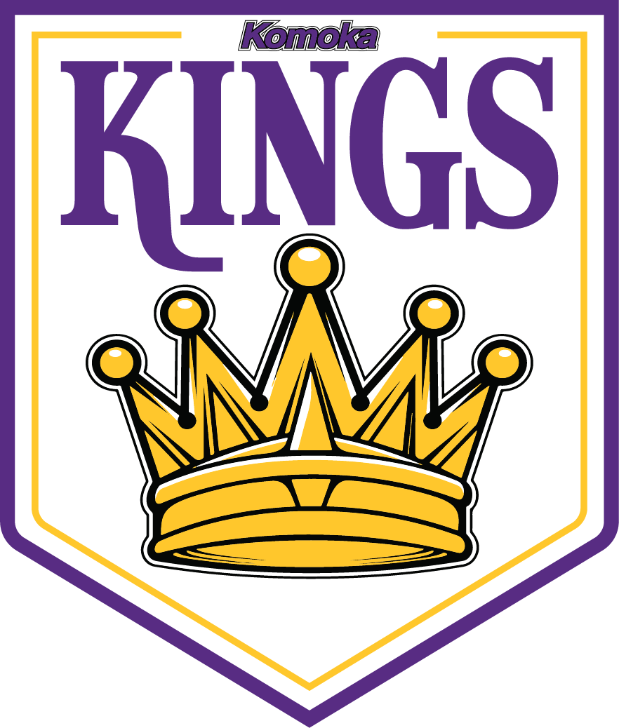
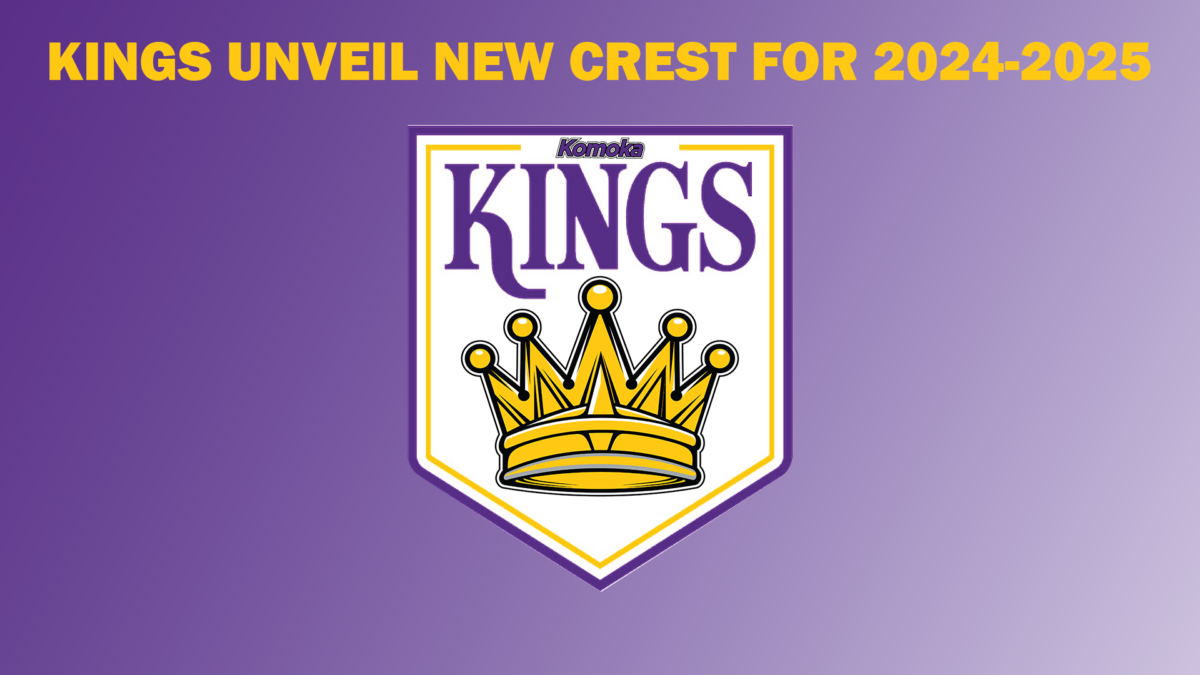
Inspired by the original, 1967 edition, Los Angeles Kings logo, this logo maintains the original komoka font seen at the top of the design.
In keeping with tradition, the font chosen for “Kings” is a regal, vintage style that evokes the vision of royalty.
the crown, a symbol of komoka kings hockey from the very first game in 2017, changes colour, from grey to gold, to match the purple and gold theme.
The Kings look forward to a strong season in 2024-2025, with their new look!


